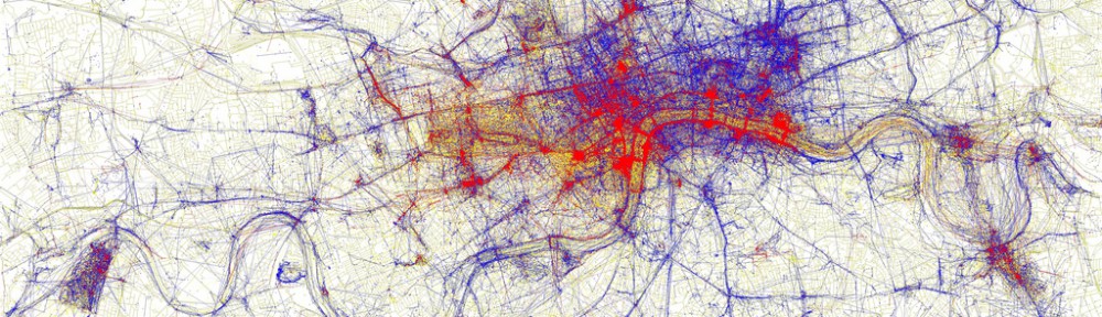
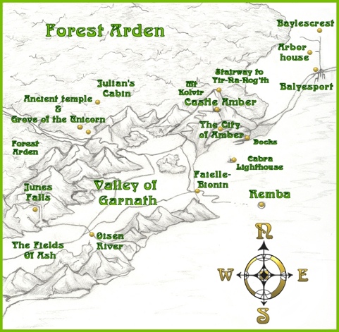
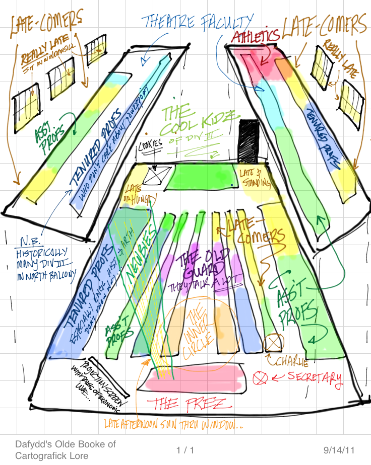
Jerry Gretzinger: Mapping the void
Reply
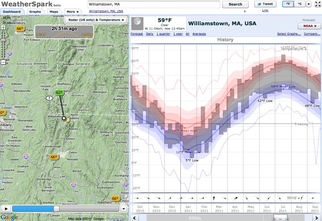 WeatherSpark is an excellent weather data visualization tool, including radar map video, temperature histories, forecast, daily averages, historical trends, and comparative weather charts…And very attractively presented.
Here’s the WeatherSpark map of Williamstown.

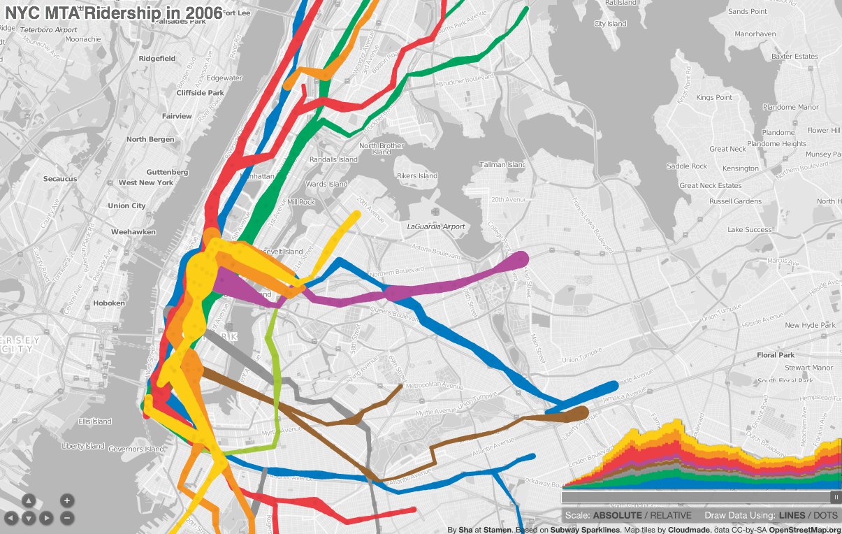 A pretty amazing map-cum-timeline of subway ridership from 1905 to 2006, displays with either lines or dots, and allows you to scrub forward and back in time. Also check out his original blog post about making the map, and the underlying data that he got from the blog frumination (which is also pretty great, the blog of a grad student in transportation and operations research.)
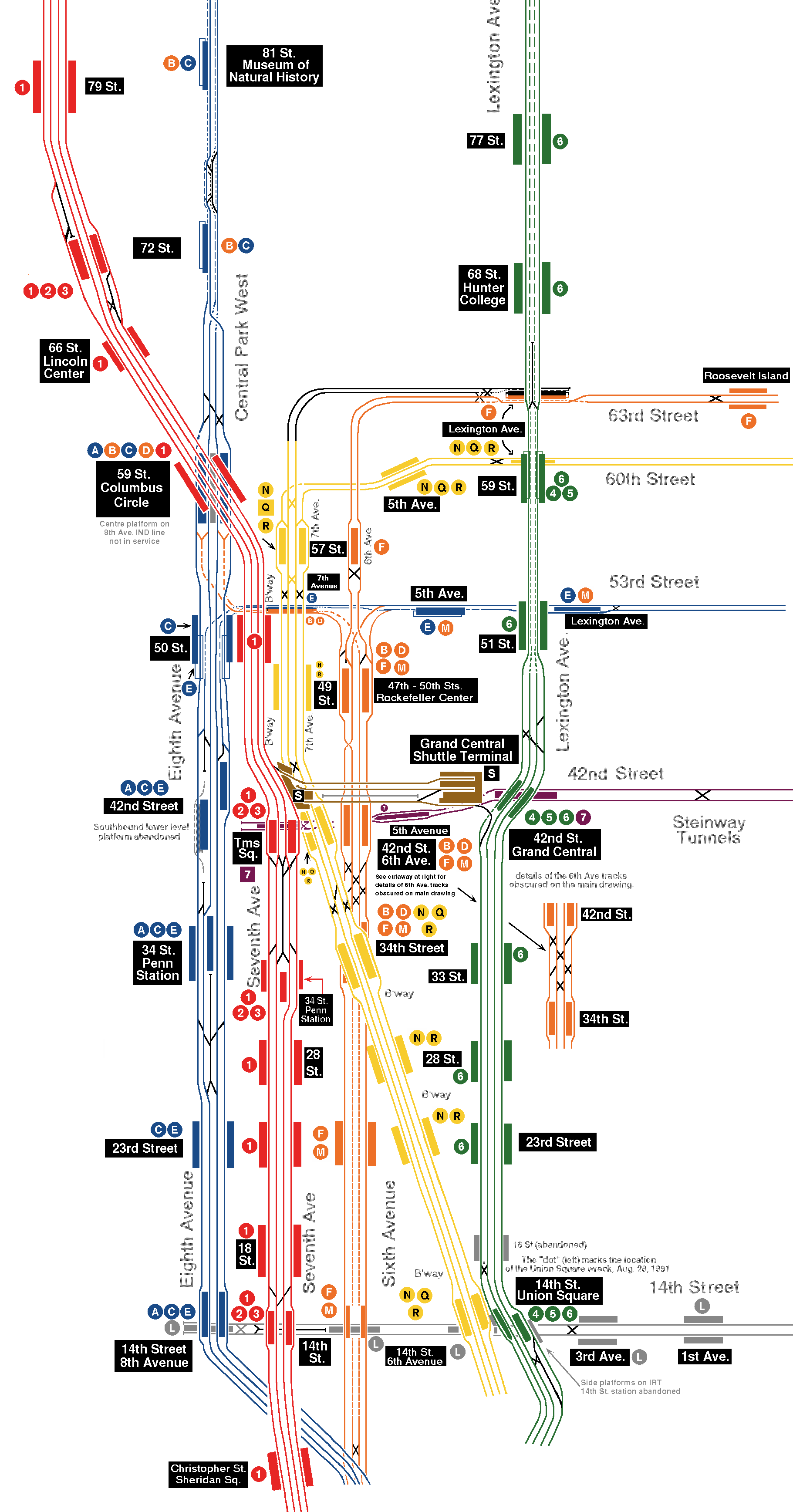
We talked about how the NYC subway map distorts the proportions and cardinal orientation of Manhattan to serve the needs of the map — laying out all of the info on the page, fitting the whole system on the map, graphical clarity. But a subway is just a line with points — from the viewpoint of the subway rider you just need to know how many stops until you transfer to the green line, then which direction to take (binary decision) and then how many stops until you get off. You don’t need to know that the F train makes a 90° turn after W. 4th, just that 2nd Avenue stop is two stations later. When leaving the subway you do need a planar map for negotiating the grid, but in the tunnels a line will do.
So if that is the case, why make the subway map resemble its geographical reality at all? Why not let it become something else, something symbolic or representative of structures and organizing principles unburdened by physical reality?…
Continue reading
Visual maps of languages are fascinating to me, since they chart so many other things — cultures, ethnic groups, historical events (invasions, immigrations and emigrations, royal marriages and other forced mergers) and more. This one is great because it maps it to words for geographical features; I’m amazed at how well it clusters! It also reminds me of how confused I was when I first moved to the northeast at the preponderance of “-kills” in the Hudson River Valley (Peekskill, Catskill, Fishkill — lots of animals being killed…) until someone explained it to me.
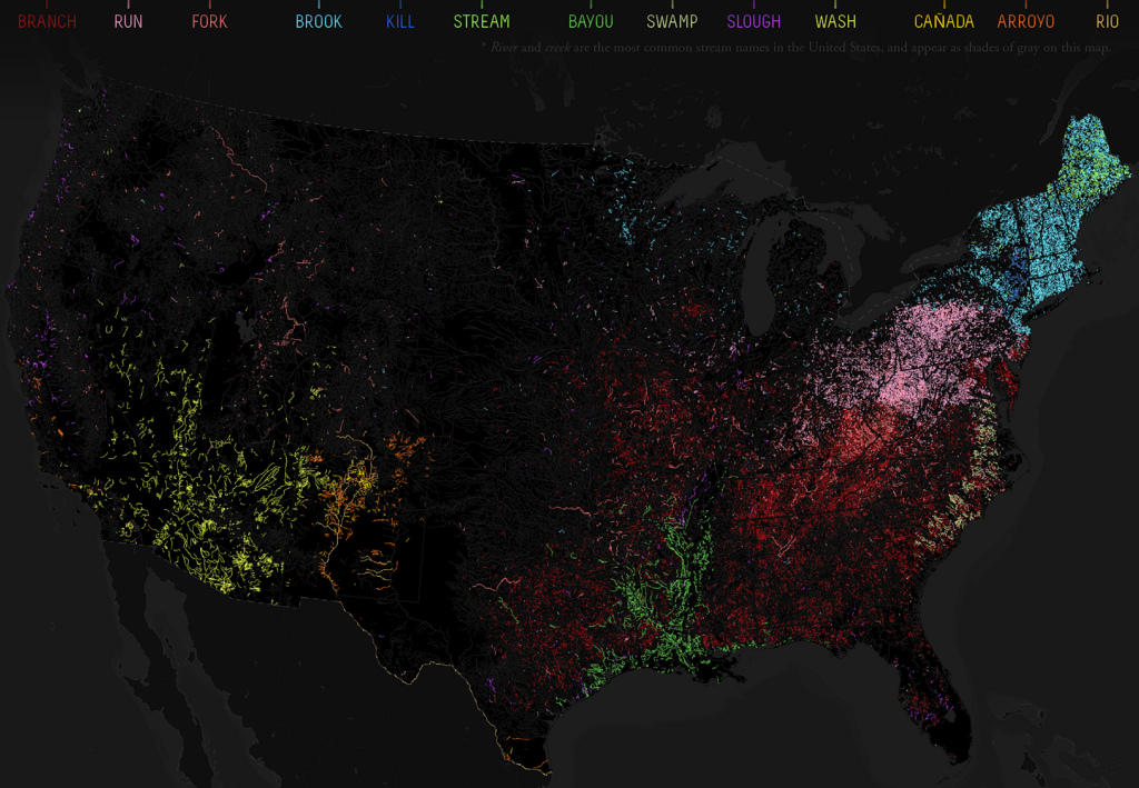
This map charts the rich variety of waterflow toponyms in the US, which reflects the climatological and geographical diversity of the country, but also its linguistic and historical heritage. River names seem extremely resistant to change, and indeed often are echoes of earlier dominant cultures [1].
The colours on the map, which is based on the place names in the USGS National Hydrography Dataset, correspond to the generic toponyms for waterflows, excluding the two commonest ones (river and creek, rendered in gray).
via 531 – A Rio Runs Through It: Naming the American Stream | Strange Maps | Big Think.
I definitely recommend clicking through and reading the whole post, which includes more explanation of each color and word (and word origin.)
DUE Thursday Sept 15 Continue reading
Of Exactitude in Science
…In that Empire, the craft of Cartography attained such Perfection that the Map of a Single province covered the space of an entire City, and the Map of the Empire itself an entire Province. In the course of Time, these Extensive maps were found somehow wanting, and so the College of Cartographers evolved a Map of the Empire that was of the same Scale as the Empire and that coincided with it point for point. Less attentive to the Study of Cartography, succeeding Generations came to judge a map of such Magnitude cumbersome, and, not without Irreverence, they abandoned it to the Rigours of sun and Rain. In the western Deserts, tattered Fragments of the Map are still to be found, Sheltering an occasional Beast or beggar; in the whole Nation, no other relic is left of the Discipline of Geography.
—From Travels of Praiseworthy Men (1658) by J. A. Suarez Miranda
The piece was written by Jorge Luis Borges and Adolfo Bioy Casares. English translation quoted from J. L. Borges, A Universal History of Infamy, Penguin Books, London, 1975.
From Wikipedia:
The story elaborates on a concept in Lewis Carroll‘s Sylvie and Bruno Concluded: a fictional map that had “the scale of a mile to the mile.” One of Carroll’s characters notes some practical difficulties with this map and states that “we now use the country itself, as its own map, and I assure you it does nearly as well.”