We talked about how the NYC subway map distorts the proportions and cardinal orientation of Manhattan to serve the needs of the map — laying out all of the info on the page, fitting the whole system on the map, graphical clarity. But a subway is just a line with points — from the viewpoint of the subway rider you just need to know how many stops until you transfer to the green line, then which direction to take (binary decision) and then how many stops until you get off. You don’t need to know that the F train makes a 90° turn after W. 4th, just that 2nd Avenue stop is two stations later. When leaving the subway you do need a planar map for negotiating the grid, but in the tunnels a line will do.
So if that is the case, why make the subway map resemble its geographical reality at all? Why not let it become something else, something symbolic or representative of structures and organizing principles unburdened by physical reality?…
The subway line map is a symbol of the variable city.
The railway is the easiest means of transportation for tourists who are unfamiliar to the city.
Every city has different numbers and structures of line and the railway system
that has been constructed for ages reflects the character of the variable city,
that is why the subway line map is the symbol of city.
The line map is simplified and modified for easy information communication and
it is different from a map on a real reduced scale.
So I thought it is possible to infuse the character of the city into the line map
with such course of simplification and modification.
By means of line map design following the character and identity of the city,
we can easily communicate with tourist with the expression of the city and
its character by aiming to develop a total tourism system with service
that targets tourism through line map design.
SEOUL RAILWAY
SEOUL RAILWAY
Seoul boasts 600 years of history as the capital of the nation and Han Gang, a river of grand size that is hard to find to flow across in any major city. Han River is the symbol of Seoul. Representation of Han River in this map mimics the curvature in the middle of the Tae-Geuk mark of the national flag of Korea. The overall circular shape of the map was also inspired by the Tae-Geuk mark. The brighter area in the center of the map, seen up close in the detail shot 1, shows the territory of Han Yang, the old capital of Cho-Sun Dynasty. This was the old Seoul marked by the Four Gates, and the growth of the city becomes clear when compared to the modern metropolitan.TOKYO RAILWAY
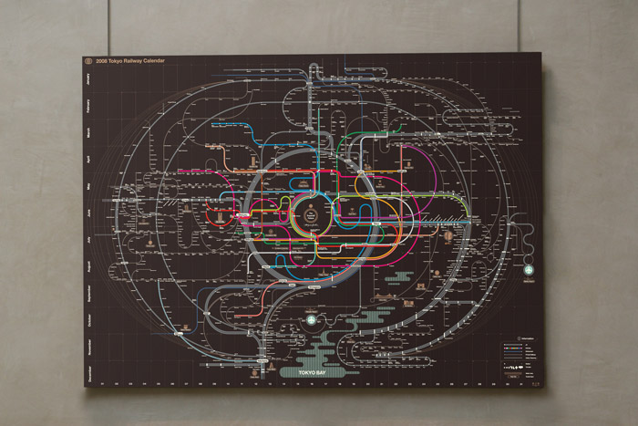
TOKYO RAILWAY
Tokyo owns the most number of railways of any kind, including subway, lightrail, monorail, etc, with more than 1500 stations that covers the metropolitan area. Places in the center of the city is the Imperial Palace, the residence of the current Ten-no (Japanese Emperor). Subway lines circumvent the expansive ground claimed by the Imperial Palace. This characteristic is visualized in this map by the concentric circles spreading out to the entire city, with the center in the Imperial Palace ground. This strong presentation of circles reminds the national flag of Japan and the Japanese identity expressed in the flag.OSAKA RAILWAY
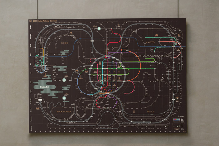
OSAKA RAILWAY
Osaka is closely tied to the surrounding cities of Kyoto, Kobe, Nara, and Wakayama. Many people traveling to Osaka also visit the neighboring cities. We connected this concept with octopus as the main ingredient of Takoyaki (Tako in Japanese), the dish Osaka is known for. In this map, Osaka metropolitan is visualized as an octopus with the head being Osaka and the legs sprawling out to the other four cities.Combination with the calendar adds more practicality. In this map, coordinates map months and days instead of latitudes and longitudes, an attempt to link temporal and spacial dimension. The additional functionality as a scheduler using enclosed post-its allows creative uses of the fresh aesthetics that the railway map provides.

via ZEROPERZERO.