You have to see this video – like mapping the void.
Category Archives: cities
New York City subway maps
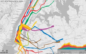 A pretty amazing map-cum-timeline of subway ridership from 1905 to 2006, displays with either lines or dots, and allows you to scrub forward and back in time. Also check out his original blog post about making the map, and the underlying data that he got from the blog frumination (which is also pretty great, the blog of a grad student in transportation and operations research.)
Imagining subway maps as symbols of their city
We talked about how the NYC subway map distorts the proportions and cardinal orientation of Manhattan to serve the needs of the map — laying out all of the info on the page, fitting the whole system on the map, graphical clarity. But a subway is just a line with points — from the viewpoint of the subway rider you just need to know how many stops until you transfer to the green line, then which direction to take (binary decision) and then how many stops until you get off. You don’t need to know that the F train makes a 90° turn after W. 4th, just that 2nd Avenue stop is two stations later. When leaving the subway you do need a planar map for negotiating the grid, but in the tunnels a line will do.
So if that is the case, why make the subway map resemble its geographical reality at all? Why not let it become something else, something symbolic or representative of structures and organizing principles unburdened by physical reality?…
Continue reading
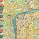
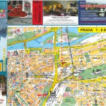
Maps from Prague summer 2011
- The battered map Sir Toby’s gave us, with annotations and tram highlighting. Best map of Prague.
- Maps are everywhere, including sugar packets
- Map of Prague in Cyrillic. Not sure why I have this.
Subway maps from class
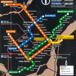
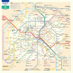
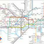
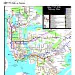
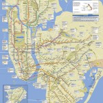
Here are the subway maps we’ve looked at in the last few classes:
- Montreal Metro
- Chicago El
- Paris Metro
- Boston T
- London Tube
- Washington D.C. Metro
- NYC subway 1948
- NYC subway 1996
- NYC subway 2011
Locals, tourists, and geotagged photos
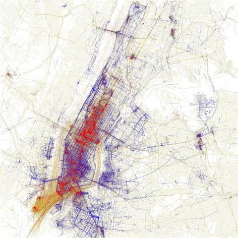
Locals and Tourists #2 (GTWA #1): New York
Blue pictures are by locals. Red pictures are by tourists. Yellow pictures might be by either.
Base map © OpenStreetMap, CC-BY-SA
Invisible cities of social networks
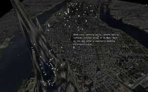 Invisible Cities
A project by Christian Marc Schmidt & Liangjie Xia
By revealing the social networks present within the urban environment, Invisible Cities describes a new kind of city—a city of the mind. It displays geocoded activity from online services such as Twitter and Flickr, both in real-time and in aggregate. Real-time activity is represented as individual nodes that appear whenever a message or image is posted. Aggregate activity is reflected in the underlying terrain: over time, the landscape warps as data is accrued, creating hills and valleys representing areas with high and low densities of data.
Overlay of European cities on North America (and vice versa)
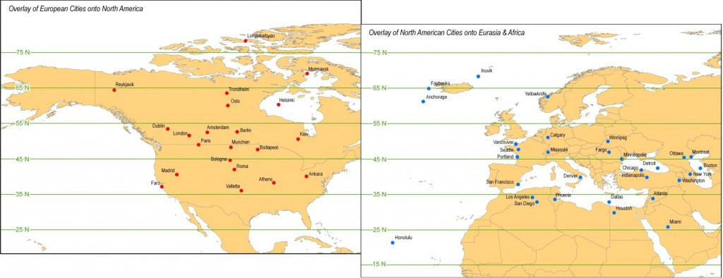 I thought this was interesting — just in terms of how far north or south stuff is in the U.S. versus Europe. Not what I would expect — Budapest is further north than the Twin Cities? And actually, a good chunk of Europe is in Canada? Some stuff is what you expect, though — the Mediterranean climate of California and the Napa Valley wine growing region, etc.
Transposition on maps of various kinds is an interesting idea…

