Map (1520s, shortening of M.E. mapemounde “map of the world” (late 14c.), from M.L. mappa mundi “map of the world,” first element from L. mappa “napkin, cloth” (on which maps were drawn), said by Quintilian to be of Punic origin (cf. Talmudic Heb. mappa, contraction of menafa “a fluttering banner”))
a visual representation of an area—a symbolic depiction highlighting relationships between elements of that space such as objects, regions, and themes. Many maps are static two-dimensional, geometrically accurate (or approximately accurate) representations of three-dimensional space, while others are dynamic or interactive, even three-dimensional. Although most commonly used to depict geography, maps may represent any space, real or imagined, without regard to context or scale [Wikipedia and Online Etymology Dictionary]
Continue reading →
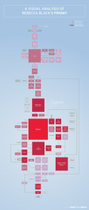
 This is terribly silly, but also an excellent example of a way of mapping a passage of text, with external factors (the “memetic significance” of various passages, i.e. “How much did was that particular section mocked in the internet/YouTube/pop cultural arena?”) taken into account and given visual expression.

