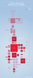
 This is terribly silly, but also an excellent example of a way of mapping a passage of text, with external factors (the “memetic significance” of various passages, i.e. “How much did was that particular section mocked in the internet/YouTube/pop cultural arena?”) taken into account and given visual expression.
http://www.upload.ee/image/1269951/rebecca_black_vertical-03.png
