
Nikhil Radosevich ‘27 created a data expression method for turning spreadsheets into 3D objects
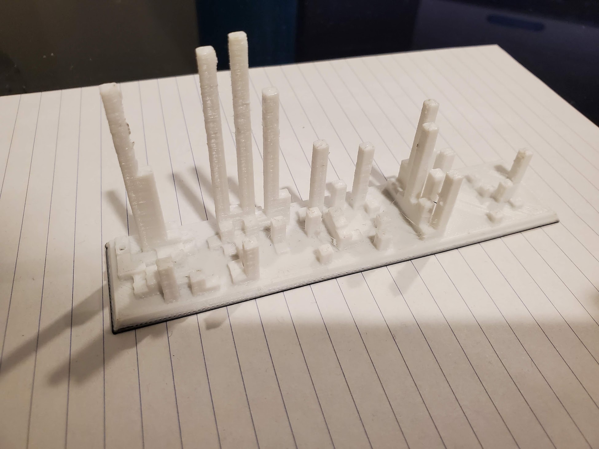
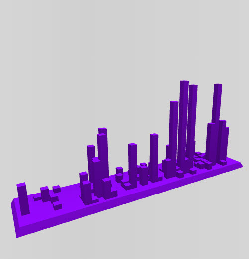
Some students see a spreadsheet and see rows and columns. Nikhil Radosevich ‘27 sees a skyline. Back in high school, Nikhil built a program that turns any spreadsheet directly into a 3D-printable file, and the print pictured above — also featured on the homepage of his site, solidifydata.com — is a perfect example of what that looks like in practice. This 3D printed object represents his own volunteer hours over the course of a year: the height of each column shows how many hours he logged, its position along the width marks the week of the year, and its depth marks the day of the week. Line it all up and a spreadsheet becomes a miniature city skyline you can hold, turn over, and study from every angle — busy weeks rising up like towers next to the quiet stretches in between. It’s a small, clever reminder that data doesn’t have to stay flat on a screen to be understood.
Nikhil Radosevich ‘27 created a data expression method for turning spreadsheets into 3D objects
Now a student at Williams, Nikhil is applying that same creative instinct to campus sustainability data, and this summer he reached out to the Makerspace hoping to print physical visualizations that the Zilkha Center could share with staff and other stakeholders. Makerspace Program Manager David Keiser-Clark welcomed him back, connecting him with Divine Uwimana ’27 and Qi Wang ’26, who are staffing the Makerspace this summer and ready to help turn his files into finished prints, each taking less than three hours of machine time to produce. David also shared Nikhil’s work with colleagues across campus, including GIS expert Cory Campbell, who may find fresh ways to apply the same approach to spatial data. It’s a nice example of what can happen when a student’s independent project meets the right campus resources: a tool Nikhil built for himself in high school is now becoming a bridge between the Makerspace and the Zilkha Center’s efforts to make campus data something people can see, touch, and talk about.