A little more than a year ago, we sent out a message to the community that kicked off a comprehensive redevelopment of the college’s website. What we said then:
Our aim is to build a website that deepens people’s engagement with the college and with each other, whether prospective students and families, alumni, current students, faculty, staff, or visitors. The redesign project will occur over the next several months and involve the entire Williams community.
Today, it’s our great pleasure to share with the college and the wider world the new Williams website, which was indeed the result of several months’ work and the valuable input of the entire community. Our deepest thanks go to the faculty, students, staff members, alumni, and others who served on the various stakeholder groups and provided critical guidance and feedback all the way through.
So, where did we end up? You can read the whole, long story on the pages of this site, but here’s a quick recap of what’s been done and highlights of some of the new site’s features.
Before we go any further, please know that we’re eager for your feedback, now and in the future. We know the new site won’t be perfect, though we’ll be working constantly to make it so. Your help—alerting us to errors you find or problems you encounter, offering better ways of organizing or presenting content, and suggesting issues we might not have considered—is critical to that work. So please share your thoughts via the feedback form on the website or by sending an email to [email protected].
Now, on to the goods.

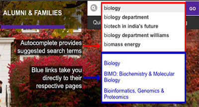
Two type of autocomplete help: The phrases in black are possible search terms suggested by our Google search engine. The blue links are sites related to query you entered. Click one of those and you are sent directly to that site.
Simplified navigation. We knew we needed to make the site’s main navigation much simpler, with far fewer links on the homepage to help visitors find their way more easily. The main navigation is now just four intuitive categories, with no drop-down or submenus, and almost no secondary navigation on the homepage.
Improved search and directories. Along with simplifying the navigation, it was clear from all reports and site analytics that we needed to improve our search function. We also sought to consolidate several directories and the search into a single, easy to use function. We’ve added an auto-complete function to the search, as well as hundreds of Google promotions that allow us to essentially tag content in ways that make it easier to find based on the ways we know people are looking for it. The consolidation of these functions means that typing a word into the search box will yield an organized set of results, showing you websites, people, and places related to your search.
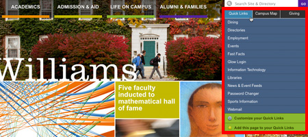
 Customizable Quick Links. Just under the search box on every redesigned page, you’ll find Quick Links, a set of default links that represents some of the most visited pages on the website. But you may need to use a completely different set of pages on a regular basis. You can customize (and save) your own quick links in a minute or two. All the links in the A-to-Z index are available, or you can add any URL (including external ones) to create a quick links list that’s just for you. Check out the documentation to learn more. One caveat: the mobile version of this tool is still under construction. You can test a beta version on the iPad; the phone interface is coming soon.
Responsive, mobile-friendly design. The college’s new website is decidedly mobile friendly. The whole thing has been developed using responsive design, which means we’ve done our best to take into account the type of device and size of screen on which you’re viewing the website and adjust accordingly. The universe of mobile devices is crowded and ever-changing, however, so we’ll continue to refine how the site looks and behaves on mobile phones and tablets. If you see something that doesn’t look right on your device, please let us know.
Though our new pages are designed to look good on small screens, this launch does not include a comprehensive set of mobile services. We’ll be working on creating more app-like functionality in the coming year. Let us know what tools you would use on a regular basis.
Consistent yet flexible templates for interior pages. The whole site is built in the WordPress content management system, which allows for easy webpage creation and maintenance. Within WordPress we’ve created a new Williams “theme.” A theme is a collection of page templates and components (image galleries, slideshows, news feeds, etc.) designed to work flexibly together. Our goal was to give the departments and offices using this theme the ability to customize the way their content is displayed. At the same time, the theme will provide consistent navigation and functionality for visitors to the site.
Better visual design and use of images and multimedia in telling the Williams story. The college’s homepage is in many ways its front door. We wanted to step up the visual design considerably, de-clutter the homepage and make its content more compelling and lively, especially to external audiences. We wanted images that would provide a sense of place and content that would give voice to the community and encourage visitors to encounter Williams in new ways. The feature grid can achieve that with a diversity of stories that will change over time, showcasing the work of faculty, students, staff, and alumni, and highlighting distinctive elements of the Williams experience.
We hope you find many things to like about the new Williams web. We’re not done, of course. We’ll be working constantly to improve the website, and we look forward to working with you over the coming months to bring your sites into the new design.
What’s next?
As we keep refining the site, we’ll move into the next phase of work, converting existing sites to the new design. Read more about that process, including how to get your site moved into the new design.