The website redesign working group is pleased to present this guided tour of the design work to date. We feel we’ve made great strides in recent weeks, thanks in large part to your feedback on earlier stages of the project. We look forward to getting your thoughts on the design mockups below.
Elements of the homepage design
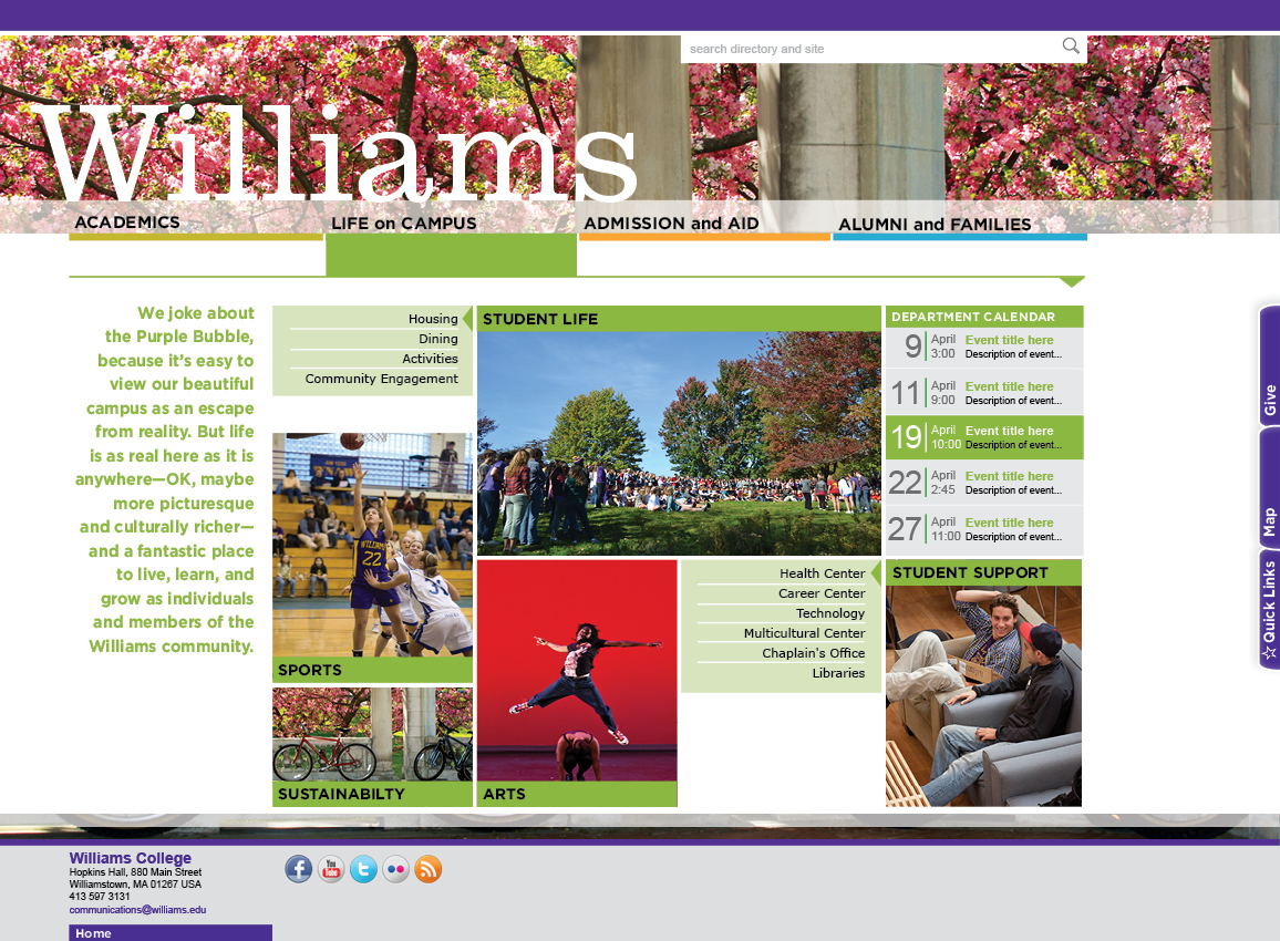
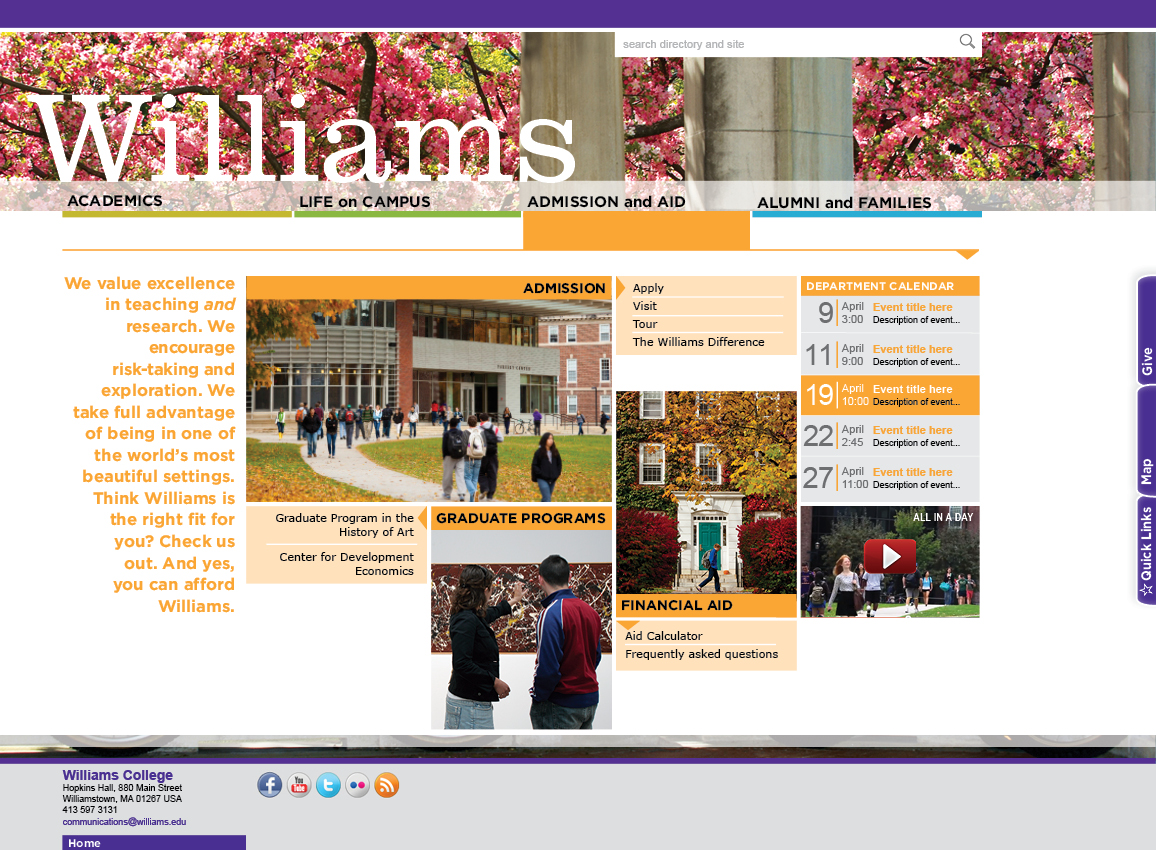
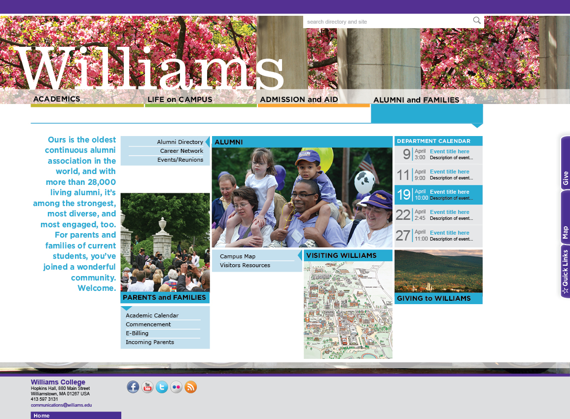
- Our strategy for the homepage employs a vastly simplified navigation and structure and far fewer links than on the current homepage. The homepage’s primary audience is external.
- Using feedback from the emotive survey and website survey, the design aims for clarity and sophistication and makes the most of high-quality images and video to engage visitors.
- The homepage’s main structure is composed of four central navigation elements: Academics, Life on Campus, Admission & Aid, and Alumni & Families.
- An improved search interface will allow users to search the site and the college directories (A-Z, people, departments and offices) at the same time.
- Utility tabs on the right side of the homepage offer users access to Quick Links (which will be fully customizable if desired, with default links to the website’s top hits), the campus map, and online giving.
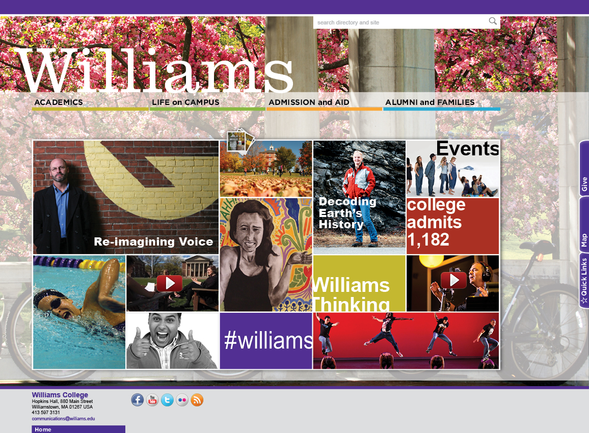
- A background image will change at least seasonally and provide visitors with a sense of place. That background image will also be featured on the central grid of the homepage, an image that will link to a changing slideshow of photos from the college’s Flickr collection.
Please note that all the images below are linked
to a larger version. Click one to take a closer look.
| Homepage: Typical feature grid | |
|---|---|
|
 |
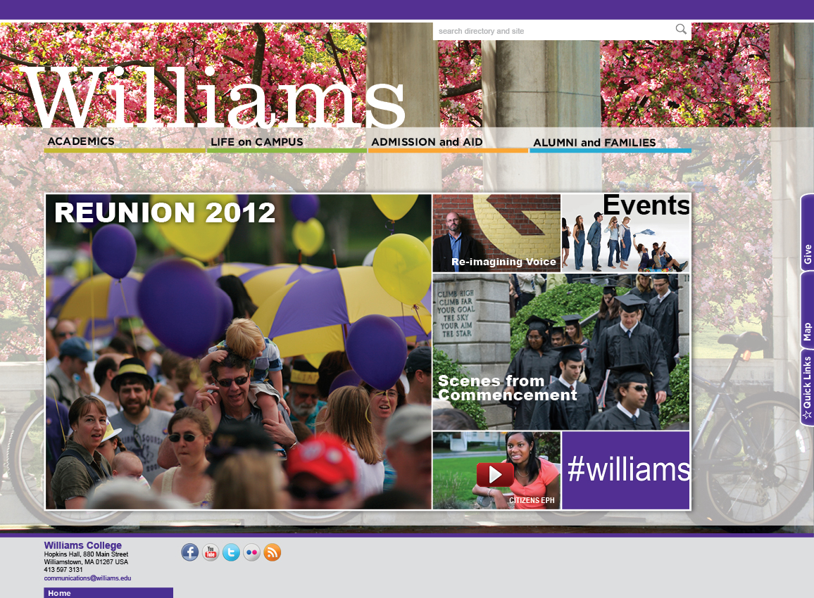
| Homepage: Primary and secondary stories | |
|
 |
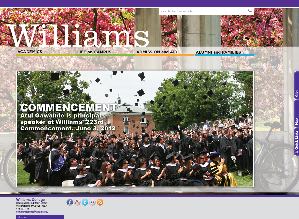
| Homepage: Big event | |
|
 |
Landing Pages
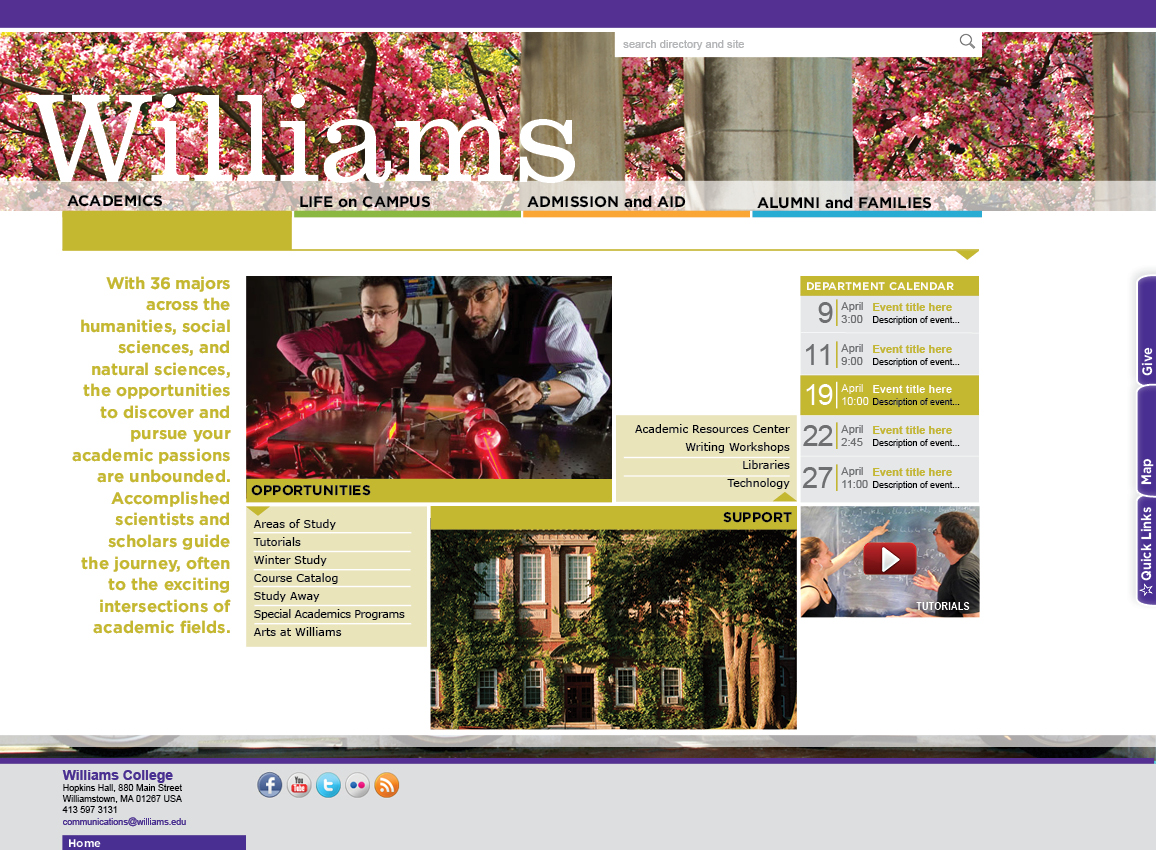
The four landing pages—Academics, Life on Campus, Admission & Aid, and Alumni & Families—serve as both destination and portal, engaging users with an overview and some storytelling elements while providing clear paths to the information visitors want.
Rather than merely a long list of links, these landing pages are intended to be informative and useful, with intuitive groupings of content. Information gleaned from Google analytics, as well as results from the website survey and card sort and feedback on the information architecture provided significant guidance in developing these important pages.
In terms of design approach, we aimed to echo the feature grid from the homepage in using images of different sizes and coupled those with overview text that’s employed as a graphic element. The Williams visual identity is consistent from the homepage to the landing pages, and the right-hand tabs for customizable quick links, campus map, and online giving appear on all four landing pages. Colors complementary to the Williams purple provide visual cues for landing pages, including color bars beneath navigation headings.
| Academics landing page | |
|---|---|
|
 |
| Life on Campus landing page | |
|
 |
| Admission and Aid landing page | |
|
 |
| Alumni and Families landing page | |
|
 |
Department/Office pages
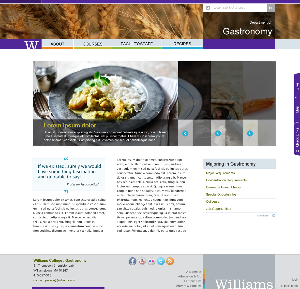
In conjunction with the launch of the new homepage, we will be rolling out a new “theme” for college websites using the WordPress content management system (CMS). A theme is the scaffolding for the site’s content. It provides the general structure of the page (header, footer, sidebars), design elements such as color scheme and typography, and tools such as slideshows and automated course listings.
At the highest level, the design of the new theme is meant to address two challenges that are somewhat at odds with each other. For the user, we are trying to create a consistency of experience across the college’s many webpages that will make them easy to navigate and facilitate the finding of information. But consistency need not mean uniformity. We will offer site creators and administrators flexibility to convey with their site a sense of the department or office’s identity.
In the slides below you will see examples of different layouts and page elements that will be available in the new theme. It is probably most useful to think of each page as a set of components that can be rearranged as appropriate and as needed. We encourage you to work with the web team to determine a configuration that best serves your content and audiences.
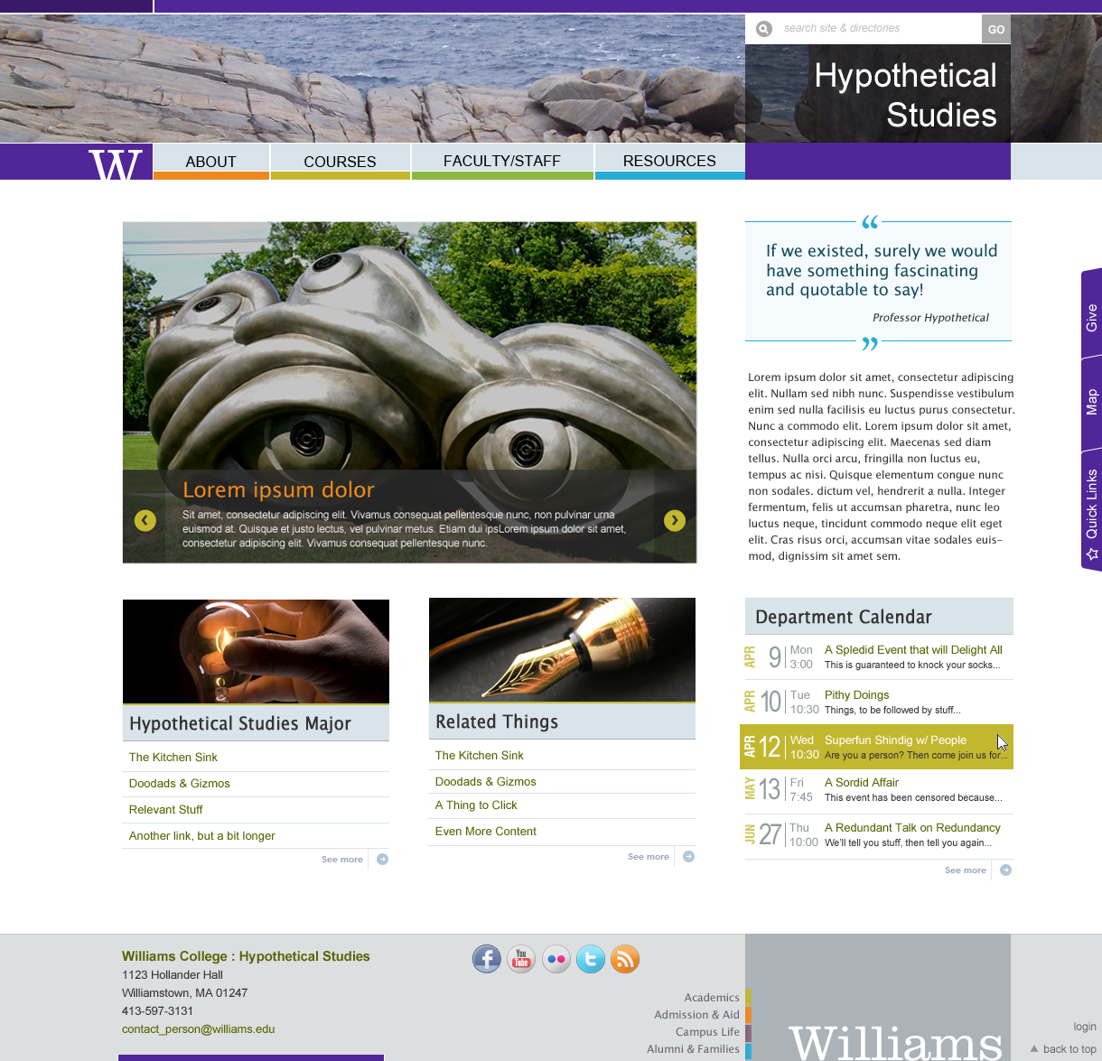
| Department main page feature slider | |
|---|---|
|
 |
| Photo gallery | |
|
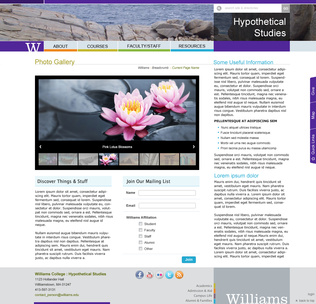 |
| Three-column layout | |
|
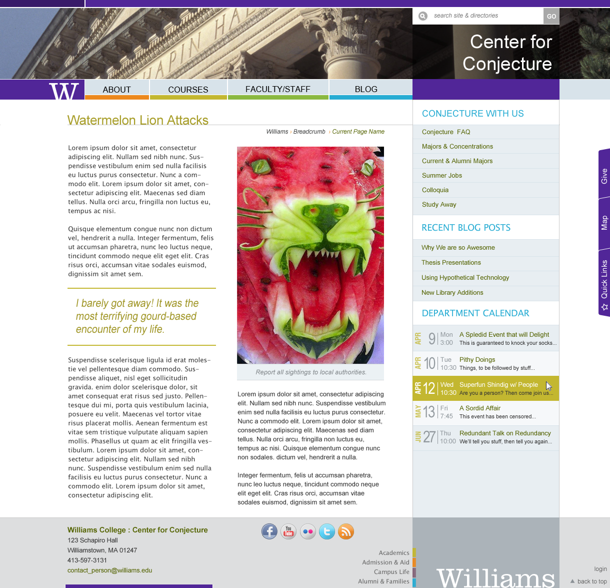 |
| Department main page | |
|
 |
| Two-column main page with large image | |
|
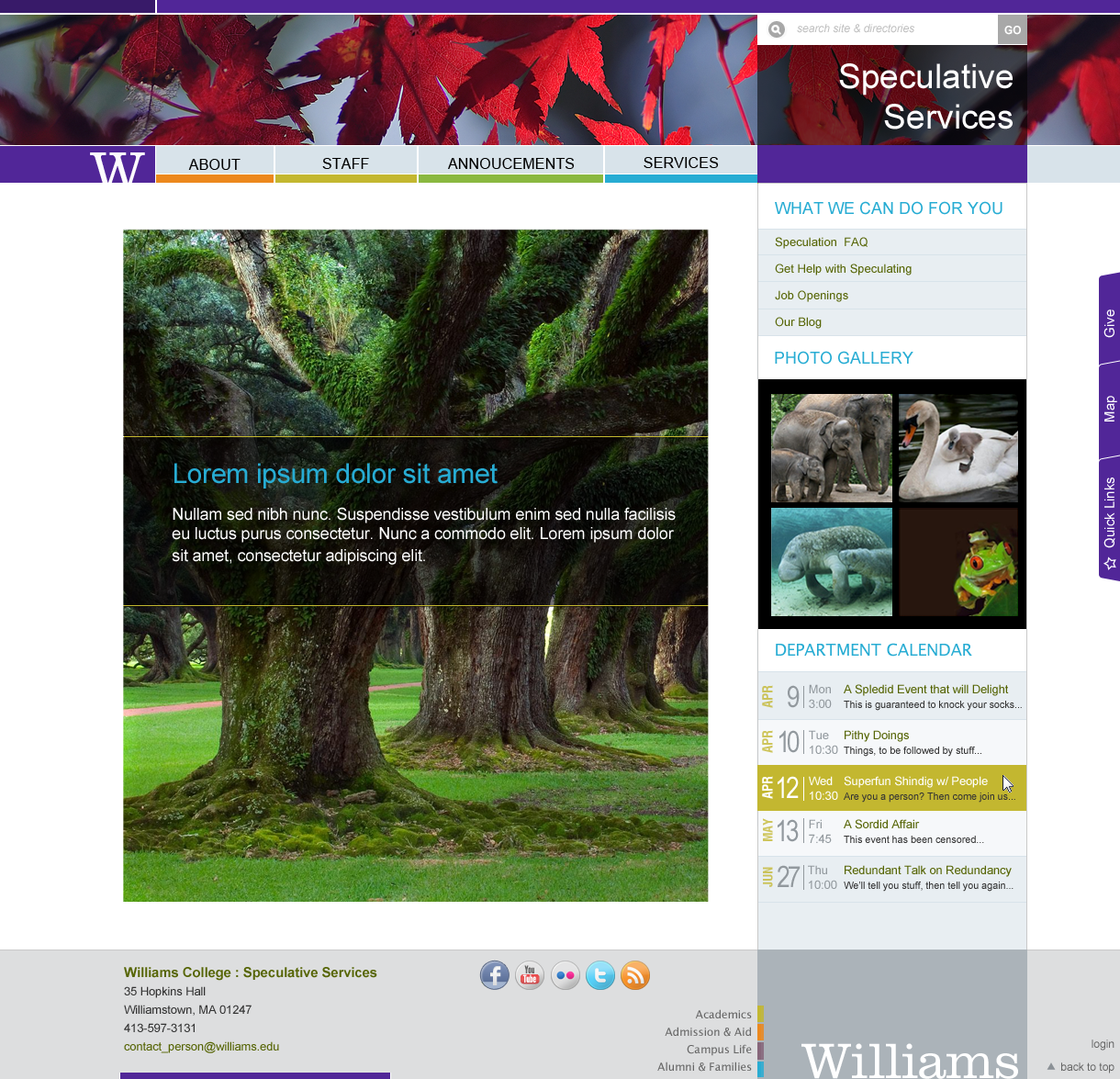 |