
Postcard 1: Map of Lanai
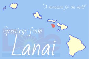
The first thing to notice is that Lanai is not a small island. It’s the sixth largest island in Hawai‘i, not a small private island. This map shows the significance of it being owned by just one person. Lanai is colored in red to show which island it is and also to connect to the color of the transparent “Dole” logo. Dole is the largest pineapple producer in the world and they previously owned most of the land in Lanai with their “pineapple plantations.” This colonial history is why there is a unique land ownership structure that allowed Larry Ellison to buy the island. “Greetings from Lanai” is written over the transparent Dole logo to show how this colonial history continues from one wealthy entrepreneur to the next. The cursive font is a specific choice to mimic the classic tropical postcard feel. Making everything seem great over the foundations of oppression. “A microcosm for the world” is a quote from Elon Musk describing how he sees Lanai. It shows the vision of this nowhere as an example for the world to follow in its efforts for remote work and against sustainability.
Sources:
“Lanai.” Wikipedia, Wikimedia Foundation, 30 Nov. 2022, https://en.wikipedia.org/wiki/Lanai.
“Dole Logo.” 1000 Logos The Famous Brands and Company Logos in the World Dole Logo Comments, https://1000logos.net/dole-logo/.
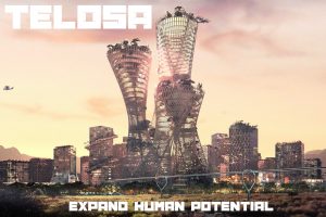
Postcard 2: Telosa for Futurists
Sources:
“City of the Future.” Telosa, 16 Sept. 2022, https://cityoftelosa.com/.
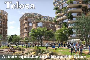
Postcard 3: Telosa for Visionaries
Sources:
“City of the Future.” Telosa, 16 Sept. 2022, https://cityoftelosa.com/.
The Telosa postcards go together by showing two different sides of the nowhere. The postcards are built in the same format but in different styles and with different messaging to attract different types of people. They’re meant to appeal to different audiences. The idea came from the website’s main page where the image for the bottom postcard is shown directly after the top one. I was struck by the difference in these pictures and decided to make them the two postcards by expanding and exaggerating the difference I saw and showing that as two different visions. The difference between color, tone, and design is all stunningly different. Keeping the same format on both is the only unity between the two postcards. The text at the bottom that I chose are both direct quotes from the website but they were not associated with either picture before this. The top postcard shows a futuristic image of Telosa with experimental buildings and a flying car highway. I chose a font that suits this style and the image and the line “expand human potential” comes from the Telosa website. In the bottom postcard, the image and the line “a more equitable and sustainable future” comes from the Telosa website as well. The font in this one is more friendly and inviting, giving off a more social-justice and visionary feel. Because Telosa will be an empty city first after it’s built, the different messaging from each postcard is important to attract diversity in who chooses to be a citizen of Telosa. With multiple Utopian projects, people get to choose where they want to be a citizen based on ideology.