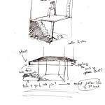
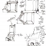
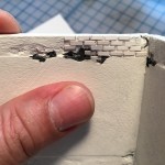
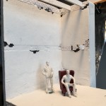
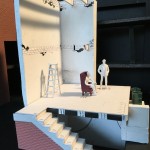
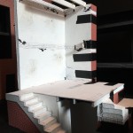
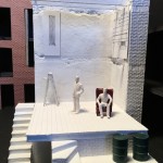
Here’s a visual story of the development of the set design for Endgame.
When I have multiple images I often find it helpful to put them in a gallery, with short captions as needed. The settings for the gallery above are
Size: Thumbnail
Columns: 3
Link to: Media File
I like linking to the media file instead of the attachment page because it allows faster access to the full-size image.
There’s nothing wrong with including images in-line, however, or using a mix of the two. Especially if you want to give a little more commentary on the media you’re embedding, or just want it to be there on the side of the text (book illustration-style) I find inline images to be better than galleries.
